Overview
Health Now, is a tele-health platform built around one idea: healthcare should fit into your life, not the other way around. The interface strips away the usual friction (no waiting rooms, no back-and-forth scheduling) and puts patients in direct contact with qualified healthcare providers whenever they need it.
Real-time chat and video keep the conversation between patients and providers natural and personal, while support across specialties from general medicine to mental health means users rarely need to look elsewhere. The goal with Health Now was to create something that actually covers people end-to-end, not just handle the easy cases.
Project Time
8-Week Design & Research Sprint
Roles & Responsibilities
UX Product Designer & Researcher
Discovery
User Research
Concept Creation & Testing
Wireframes & Prototypes
Usability Testing
The Challenge
To create a tele-health app that is easy to use, accessible, and trustworthy. The app should feature a simple, user interface that helps patients feel confident navigating it. It must also accommodate a wide range of users, including those who are not tech-savvy or who have accessibility needs.
Design Process
It's crucial that Design Professionals have a clear and concise approach when working on projects. Below, I’ve outlined my personal Design Process, a proven approach that ensures thoughtful, effective, and user-centered outcomes.
Project Background
Audience
This solution serves patients across all demographics, with particular impact for rural communities facing limited access to healthcare facilities. The platform enables convenient remote consultations, reducing barriers to care for those with mobility challenges, transportation constraints, or time limitations.
Customer Needs
Customers require a telehealth platform that eliminates geographical and logistical barriers to healthcare access. Beyond basic video consultations, they need integrated appointment scheduling, prescription management, and medical record access, all within a HIPAA-compliant environment.
Business Objectives
The business objective for this telehealth platform is to drive business growth by expanding into underserved rural markets while reducing high operational costs associated with physical facilities. The platform reduces no-shows, boosts patient retention and satisfaction, and builds a scalable revenue model with lower acquisition costs and higher lifetime value.
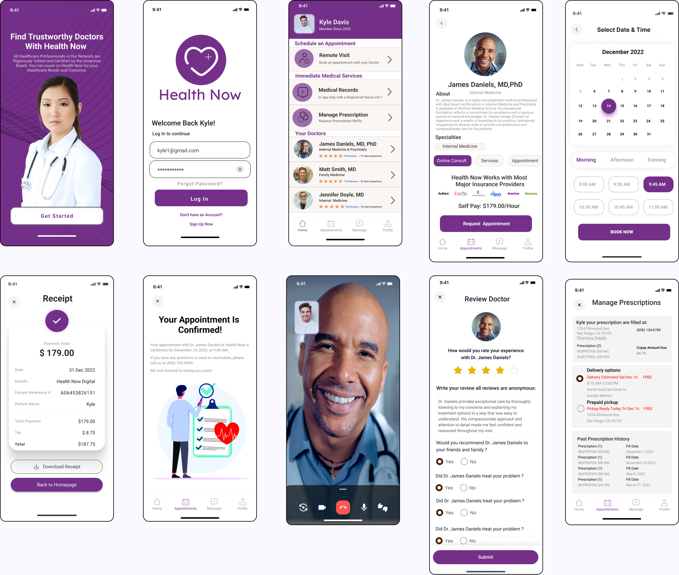
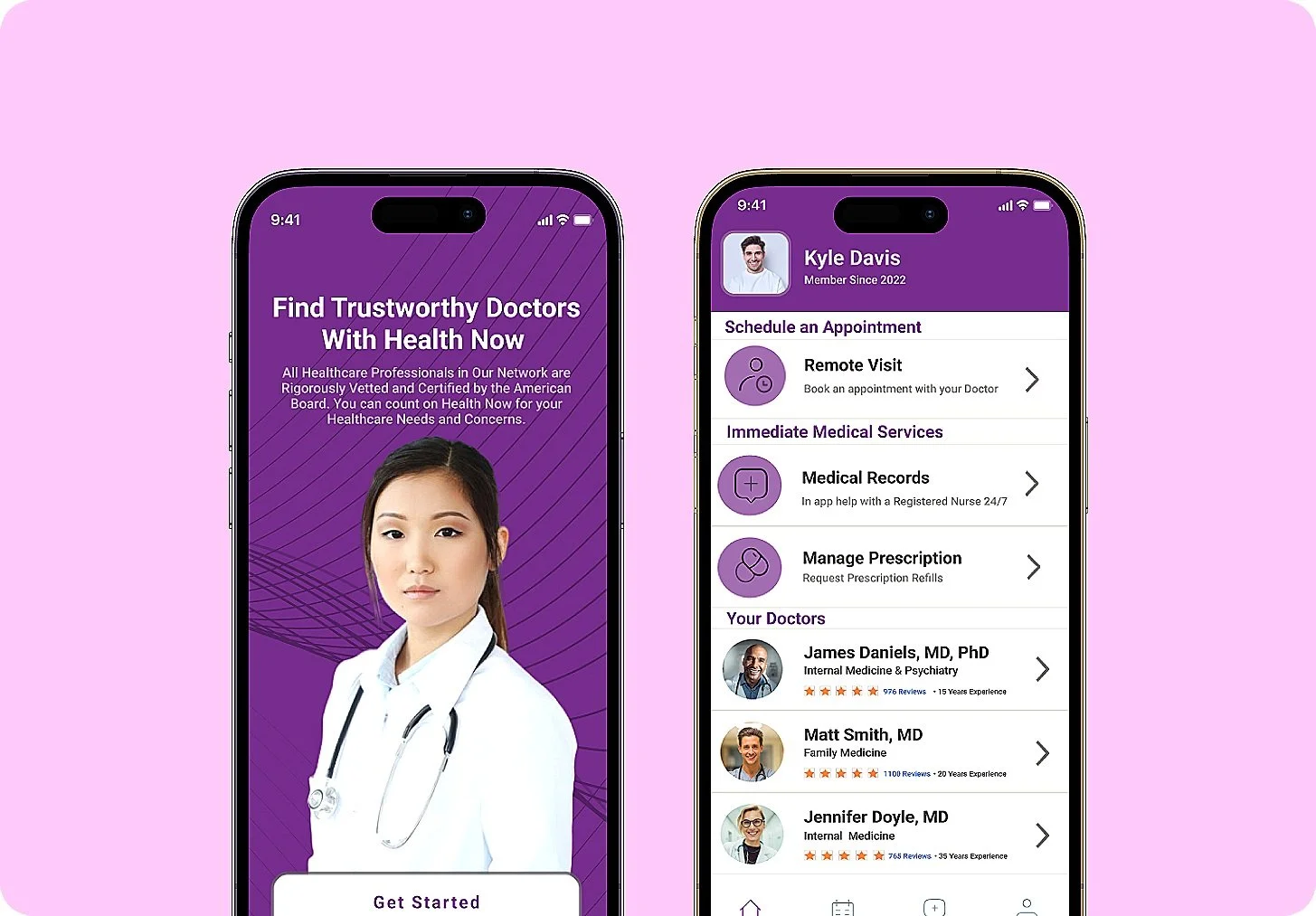
Final Designs
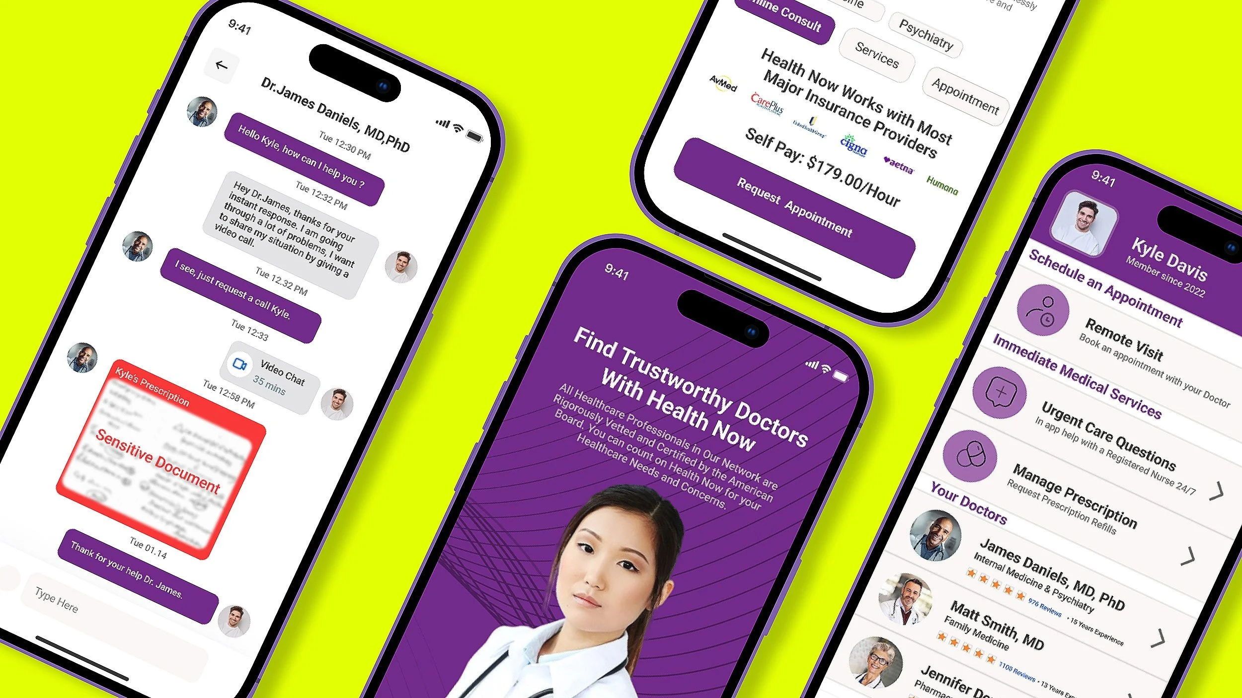
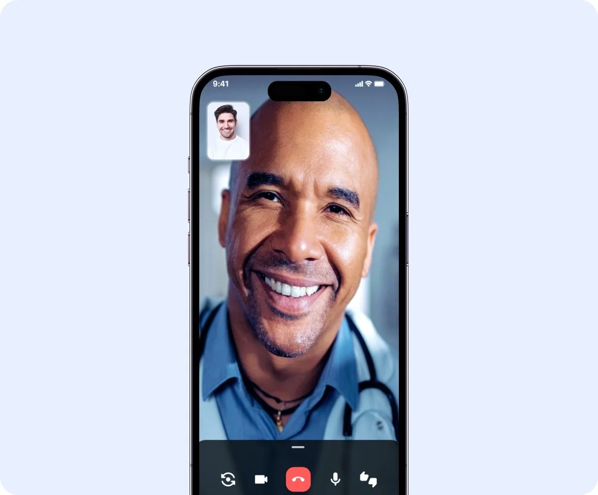
Connect with Your Doctor in Real-Time
With Health Now, patients can conveniently connect with their doctor through live video, allowing for immediate, face-to-face consultations.
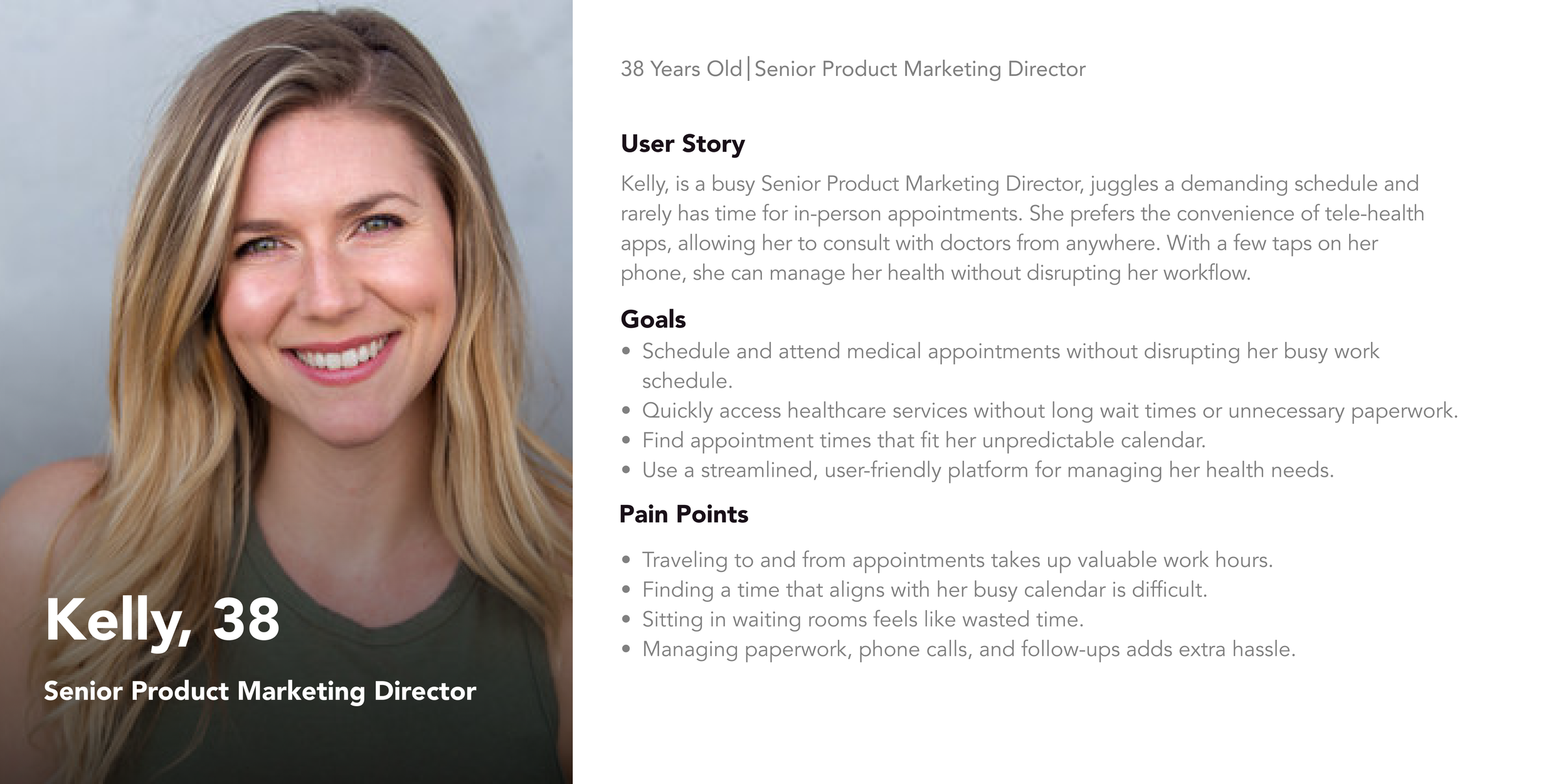
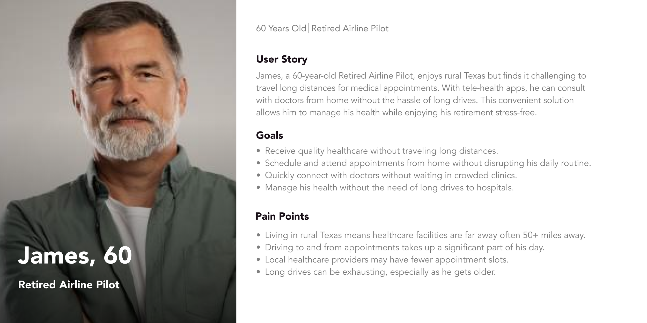
User Persona
I started creating personas to get a clearer picture of who my target users are, their needs, goals, and pain points. By understanding them better, I can design solutions that actually make their lives easier and create a better overall experience.
Get Instant Access to Care with a Single Tap
Telehealth is rapidly shaping the future of healthcare, providing patients with easier, more convenient access to medical care, regardless of their location.
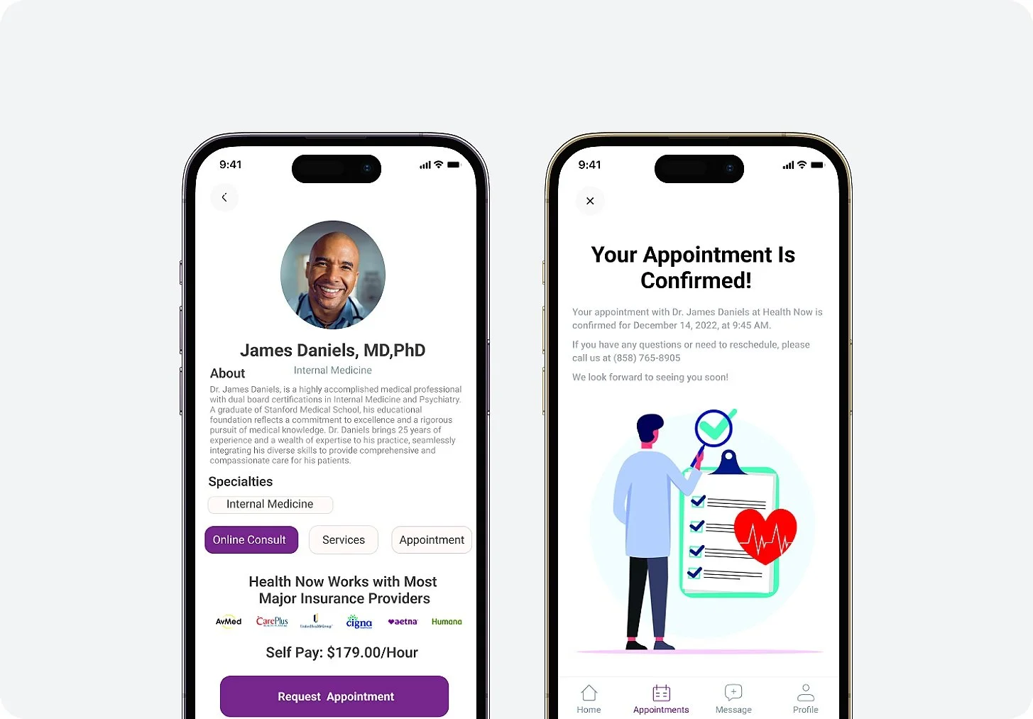
Quality Care, Simplified
Booking appointments shouldn’t slow you down, our platform is built for effortless navigation to give you peace of mind.
Additional Research
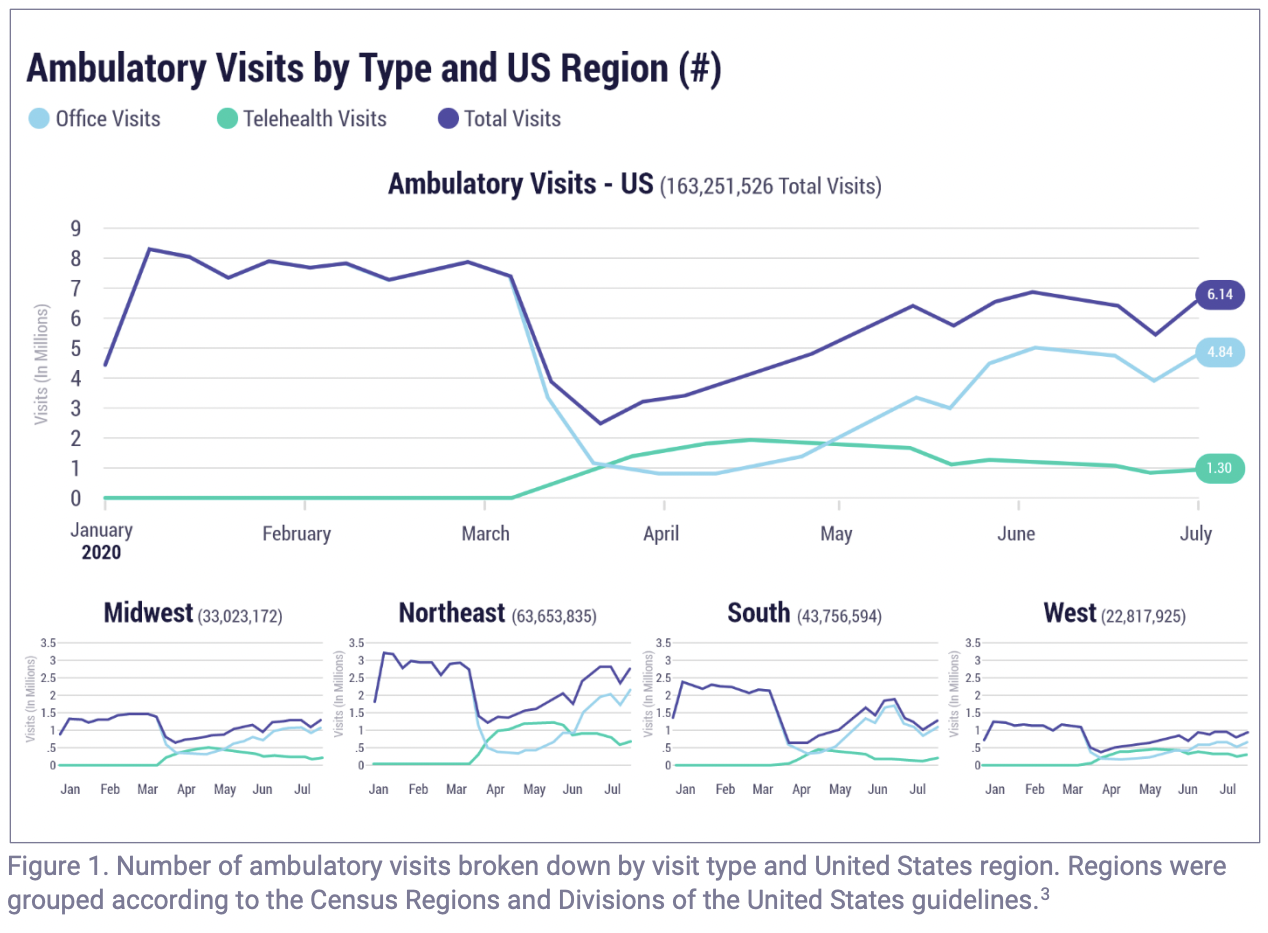
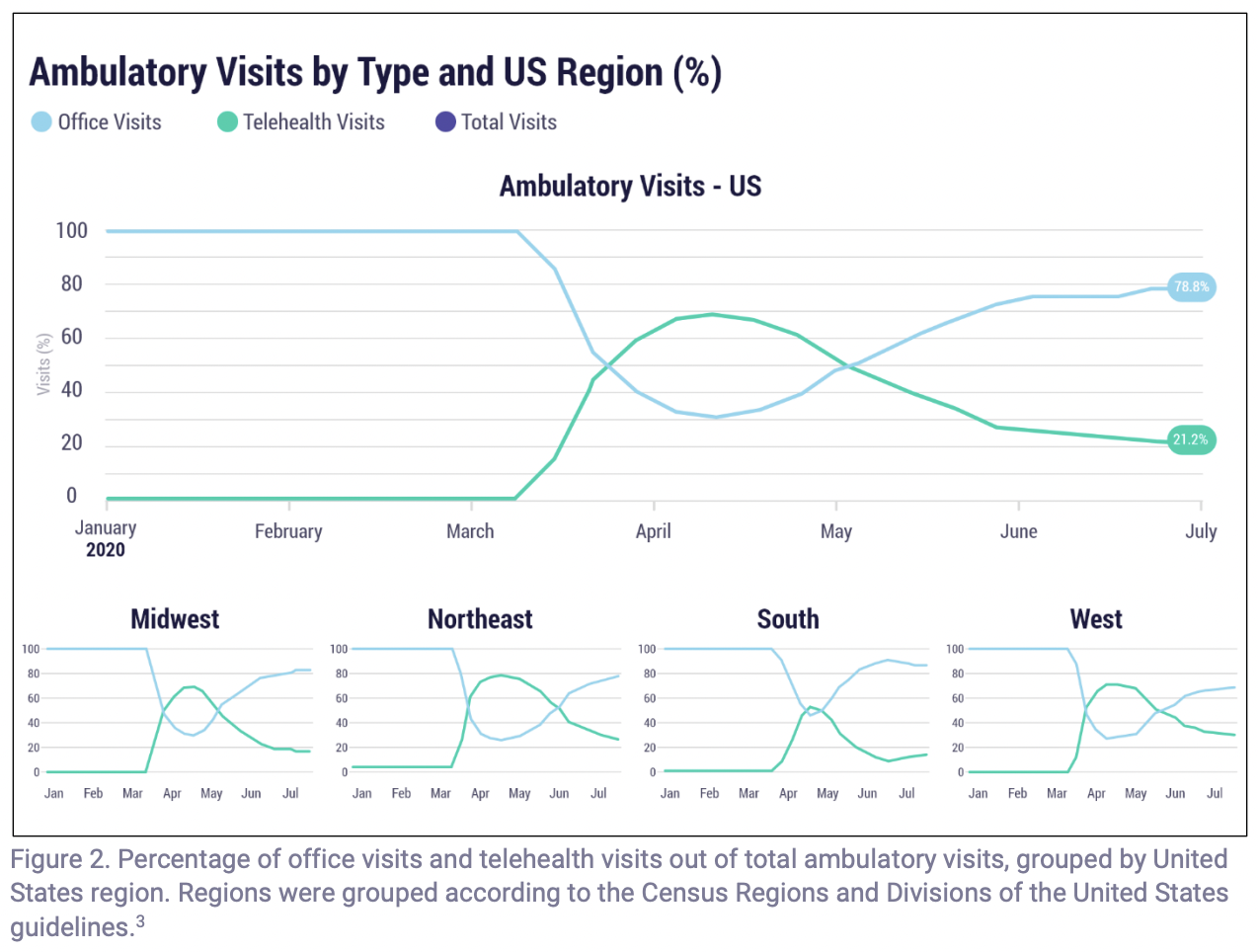
After conducting user interviews, competitor analysis, and developing user personas, I wanted to pressure-test my findings against a larger picture. I pulled open-source data from Epic Health Research Network to identify broader trends in patient behavior, looking beyond what interviews alone could tell me. The data validated key findings and brought sharper clarity to how people are actually accessing healthcare providers today.
Please Note: Telehealth appointments saw a significant increase due to the COVID-19 pandemic, impacting the trends and data presented in these references.
REFERNCES
Epic Research. (2023). Telehealth: Fad or the future? Retrieved from
https://media.epic.com/epicresearch/wordpressmedia/pdfs/telehealth-fad-future.pdf
Research
Understanding The Problem
As tele-health rapidly becomes a primary mode of care delivery, both patients and healthcare providers face critical usability and workflow challenges. Patients experience confusion due to unclear appointment flows and insufficient accessibility features, while providers struggle with inefficient virtual visit management and maintaining continuity of care. These issues hinder adoption, reduce trust, and negatively impact overall satisfaction with digital healthcare platforms.
Research Goals
I approached this project with the goal of uncovering the core pain points and unmet needs within the tele health journey. Rather than making assumptions, I committed to a qualitative research-driven process. Once the problem areas were identified, I planned and executed a series of UX research methodologies including: User Interviews, Competitor Analysis, Contextual Inquiries, and Usability Testing to gather key, actionable insights.
Moreover, the research phase was vital because it help ensured that every decision was data-informed, user-centered, and strategically positioned to deliver measurable impact to Health Now’s user interfaces.
User Interviews
User interviews were held with 5 participants, including 2 who have used tele-health apps and 3 who prefer booking in-person appointments. These in-depth interviews uncovered key data regarding user motivations and struggles when booking doctor appointments:
Awareness: Many users are unaware they can conveniently schedule tele-health appointments via their smartphones.
Financial Barriers: The high costs associated with in-person visits, including co-pays, deductibles, and travel expenses, deter users from seeking timely care.
Scheduling Conflicts: Limited availability or conflicting schedules often make it difficult for users to see healthcare providers in person.
Health & Safety Concerns: Public health risks can make users hesitant to attend in-person appointments.
Geographic Limitations: Users in rural areas often lack transportation to reach healthcare providers located over 50+ miles away.
Physical Constraints: Disabilities, chronic illnesses, or contagious conditions may prevent users from traveling to medical facilities for primary care visits.
Comfortability: Some users expressed a preference for in-person visits at a hospital when consulting with physicians or healthcare professionals, due to the sense of trust and personal connection it provides.
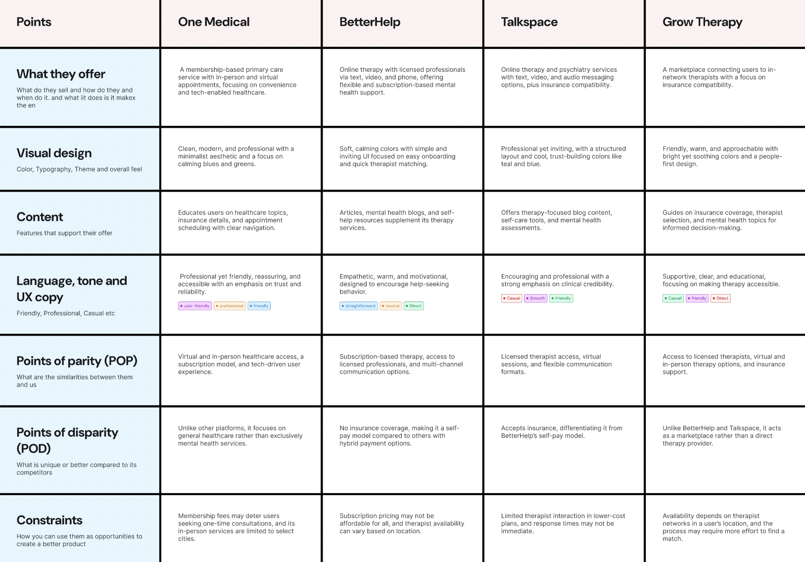
Competitor Analysis
I conducted a thorough competitor analysis of leading telehealth platforms, including One Medical, BetterHelp, Talkspace, and Grow Therapy, to examine their business models, services, user experience, and design. This process highlighted their strengths, weaknesses, and unique features, allowing me to identify opportunities to enhance the current telehealth experience and develop a distinctive market solution.
Design
Goals for the application
• Build a platform that encourages real innovation and helps patients and providers actually connect, not just communicate.
• Design an interface that feels familiar and easy to use, guiding patients smoothly from booking an appointment to wrapping up a visit without confusion or frustration.
• Design with empathy, because every patient's situation and comfort level is different.
• Create a telehealth experience that works for everyone, making virtual care easier to access, less time-consuming, and more affordable without sacrificing quality.
Design Decisions
The app was designed to make getting care feel easy and not overwhelming. The layout keeps things clear so users can quickly find doctors, book appointments, and check their health info without confusion.
Colors, text size, and spacing were chosen to make the app comfortable to read and use for everyone. The overall look is calm and professional to help users feel safe and confident using the app.
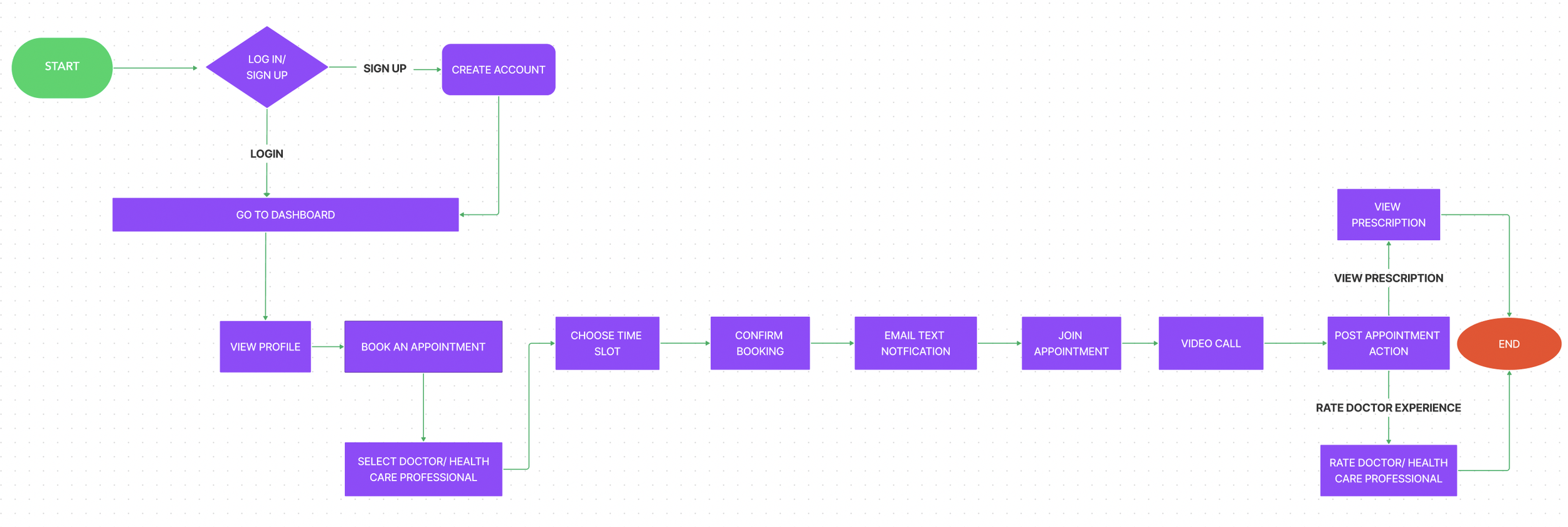
User Flow
This user flow takes patients from sign-in to appointment in just a few steps. From there, they choose a healthcare provider and confirm their booking quickly, without unnecessary steps. The experience carries through to the video consultation and wraps up with post-appointment actions like rating their provider and accessing prescriptions, all in one place.
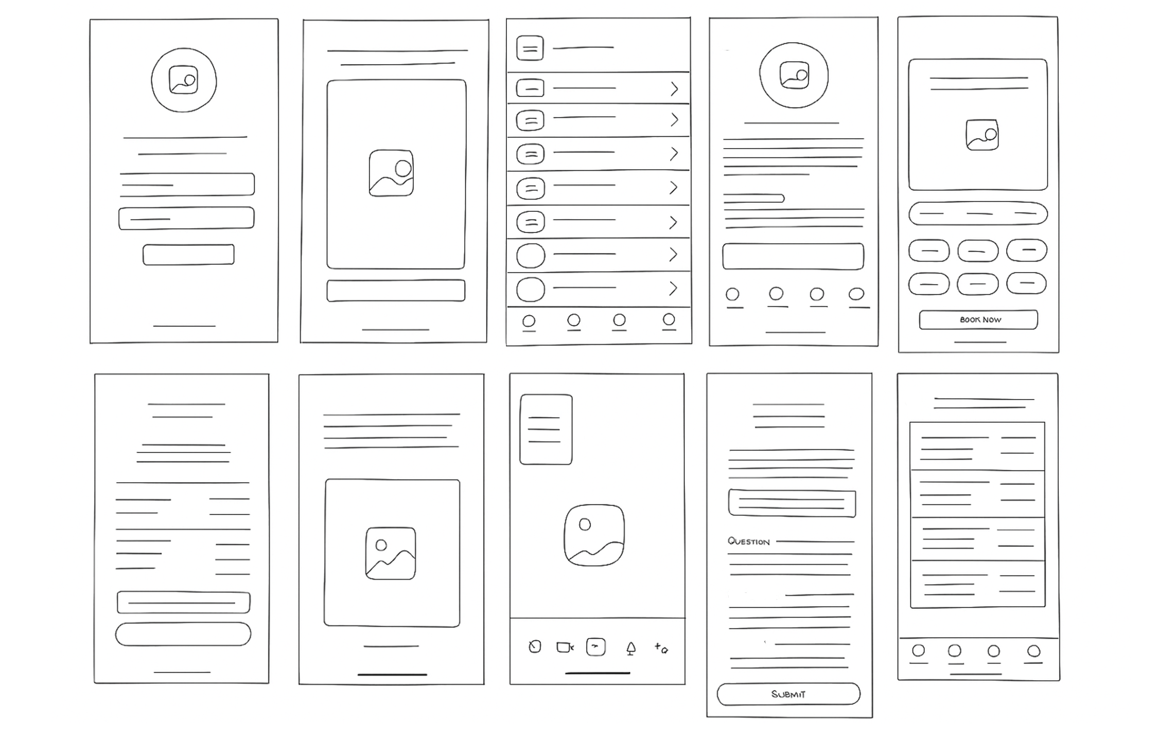
Ideation Sketches
After establishing my user flow, I started sketching some ideation sketches of what the application could look like when translated digitally. I made multiple versions, shown below is the chosen sketch that I based my wireframes on. This version best aligned with the user journey and provided a clear foundation for exploring layout and interaction details.
Mid-Fidelity Wireframes
After I defined the flow and what screens we needed, I proceeded with creating the wireframes to explore the experience in more detail on a screen-by-screen level. The main focus was the appointment setting, which sits at the heart of the app. I iterated through multiple low-fidelity versions, validating each with target users to ensure the booking process remained clear and frictionless.
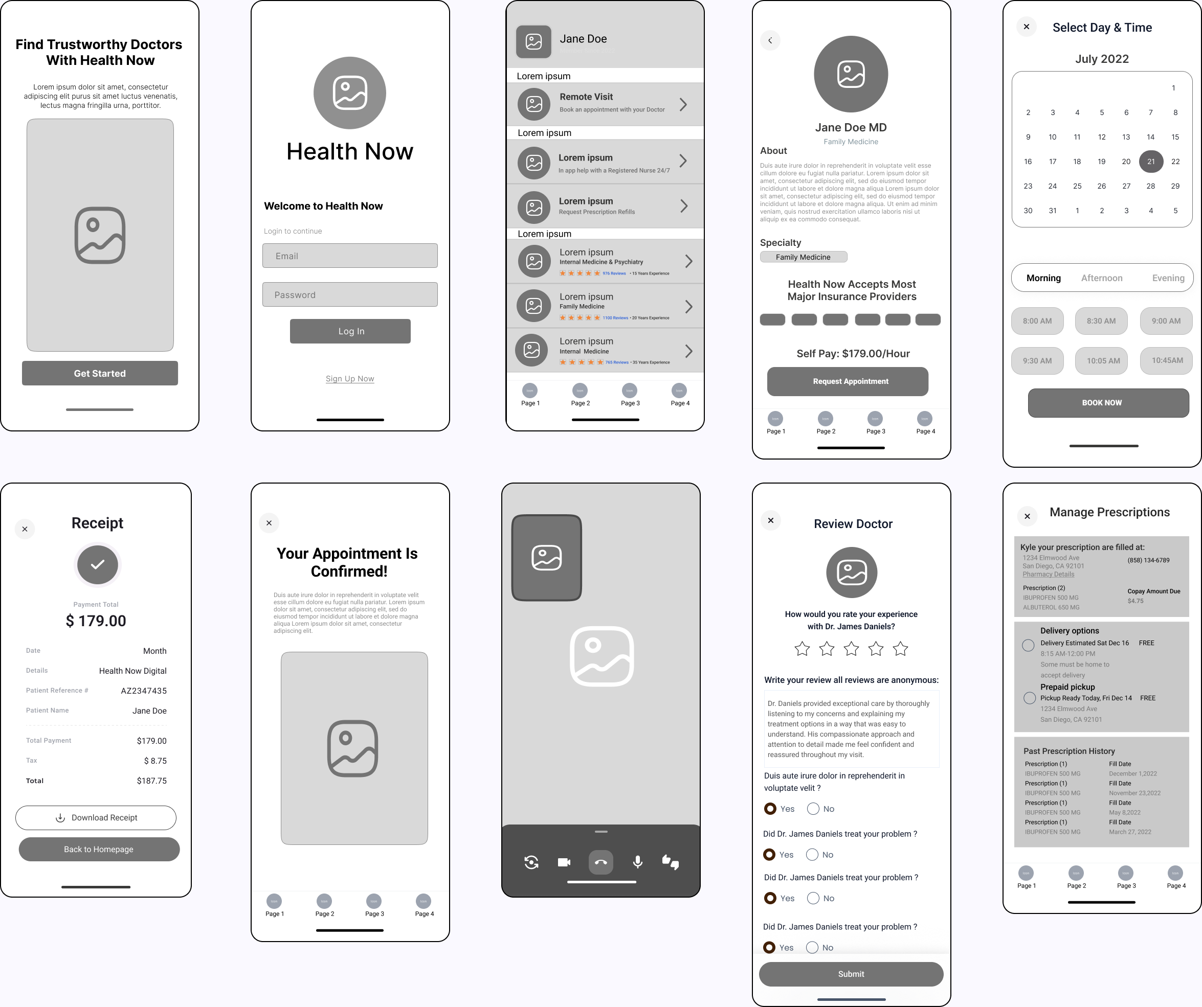
High-Fidelity Wireframes
After creating mid-fidelity wire frames I than proceeded to create high-fidelity screens to bring the user experience to life with realistic visuals. Throughout the design process, I focused on crafting a smooth and visually appealing interface that not only enhances usability but also drives users to successfully book appointments with doctors.