Overview
The TireRack homepage and cart redesign is all about making the shopping experience effortless and enjoyable for customers. We’re focusing on making it easier to find the right tires and automotive products, creating a sleek and modern look, and simplifying the checkout process to increase sales.
The redesign gives users a clear path from browsing to buying with a layout that feels polished enough to build trust and simple enough to get out of their way.
Project Time
December 2022 Kickoff - March 2023 Launch
Roles & Responsibilities
UX Product Designer & Researcher
Discovery
User Research
Concept Creation & Testing
Wireframes & Prototypes
Usability Testing
The Challenge
To redesign the TireRack.com homepage, category page, product detail page, and cart page to improve usability and conversion. The goal is to make it easier for users to find the right tires and products based on their vehicle, driving needs, and budget.
The redesigned experience should make the purchase process smoother, help more users complete their orders, and work well on both desktop and mobile devices
Design Process
It's crucial that Design Professionals have a clear and concise approach when working on projects. Below, I’ve outlined my personal Design Process, a proven approach that ensures thoughtful, effective, and user-centered outcomes.
Audience
Tire Rack primarily serves car owners, automotive enthusiasts, and professional drivers seeking high-quality tires, wheels, and related accessories. Their audience ranges from everyday drivers to tire shop owners who value expert advice and reliable product selection.
Customer Needs
Customers need a fast and accurate way to find tires and products that fit their vehicle and driving habits. They also require transparent pricing and reliable product information, including tire sizes, quality brands, and trustworthy customer reviews.
Business Objectives
The main business objective is to increase customer satisfaction and conversion rates by simplifying product discovery and checkout through a redesign. Another key goal is to enhance brand loyalty by providing a more personalized and informative user experience.
Project Background
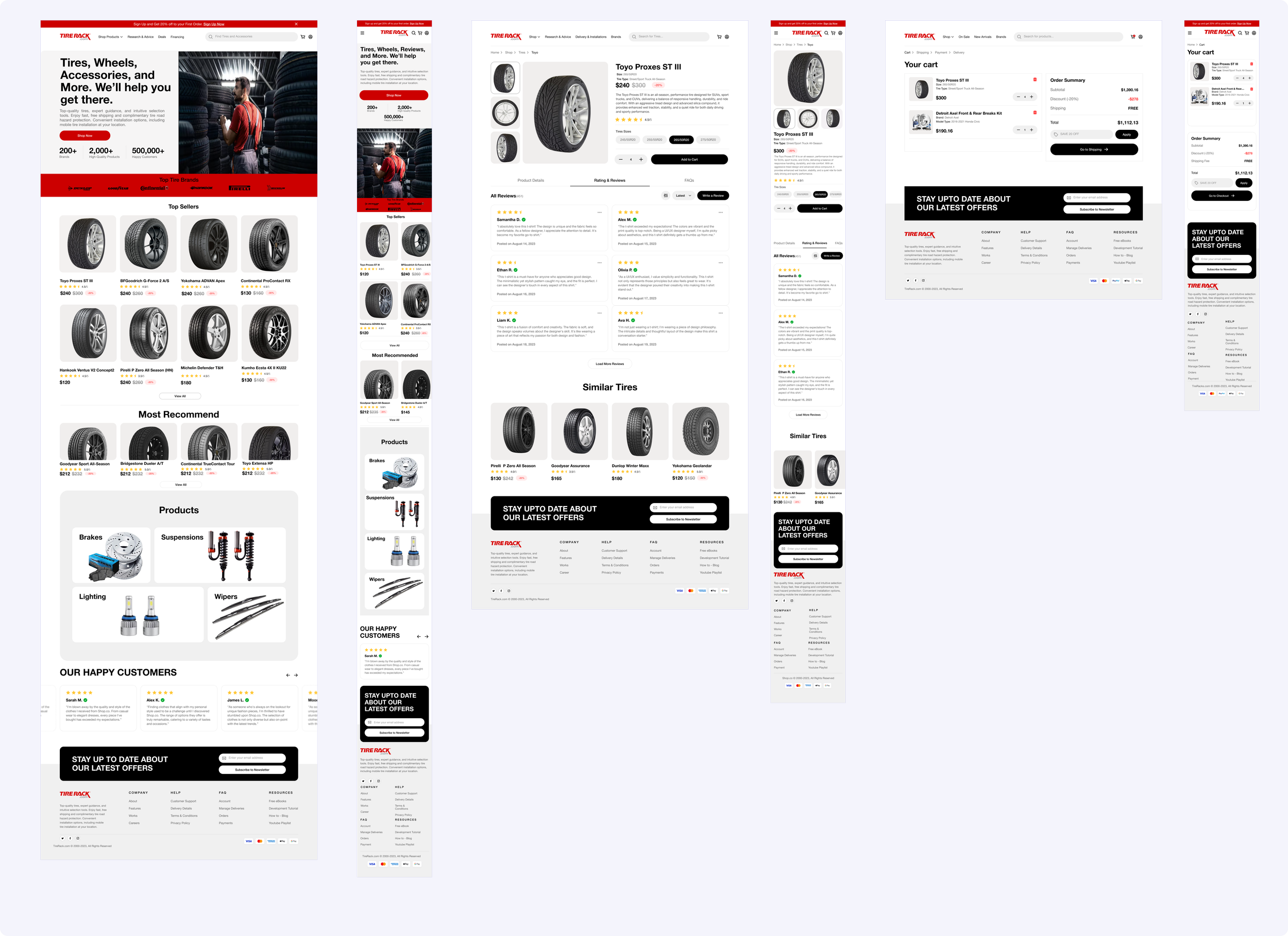
Final Designs
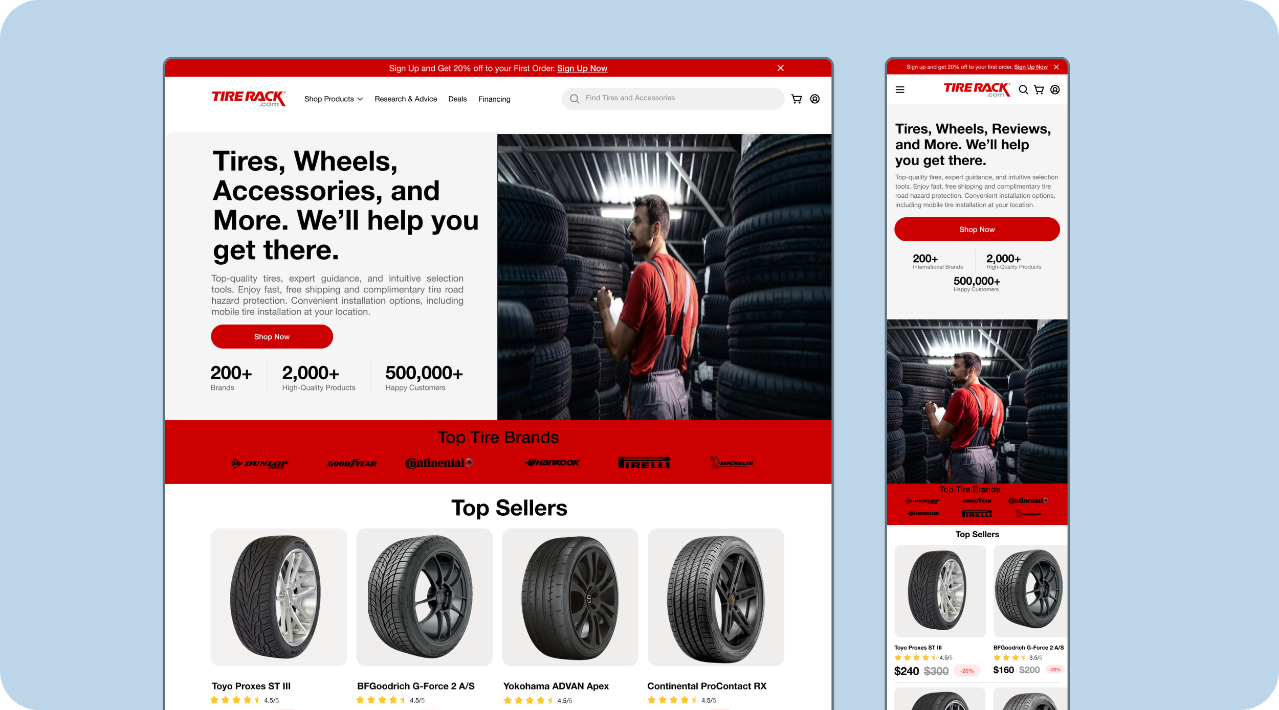
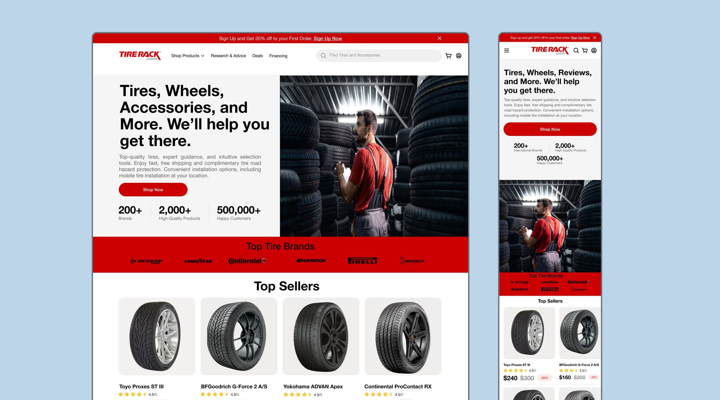
Easy Product Selection
Find the perfect tires in minutes with TireRack’s smart sizing tool, which instantly matches options to your vehicle for a smooth shopping experience.
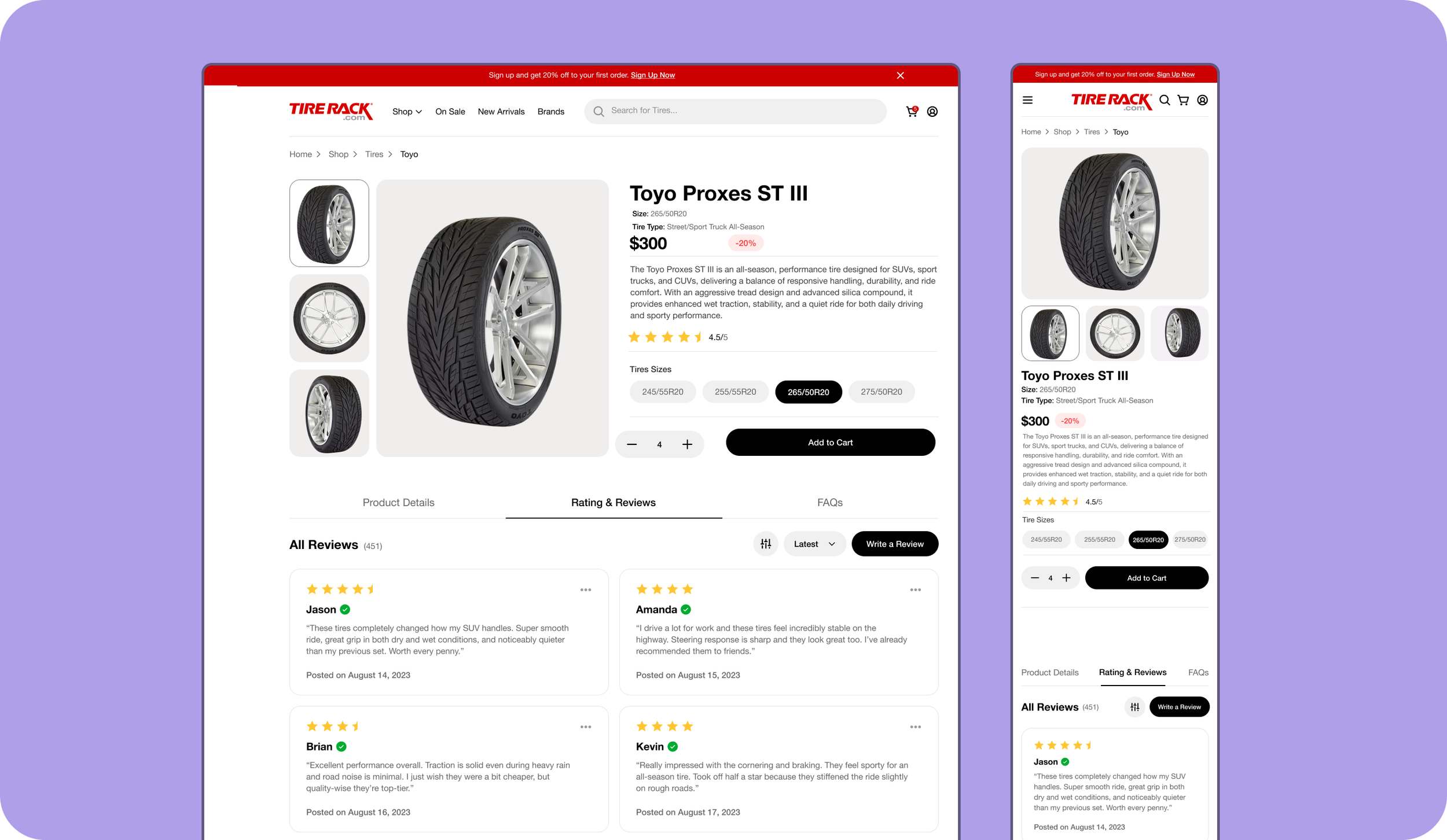
Get the Perfect Tires
TireRack makes it easy for drivers to find, compare, and buy the best tires by offering a fast, expert-guided online shopping experience.
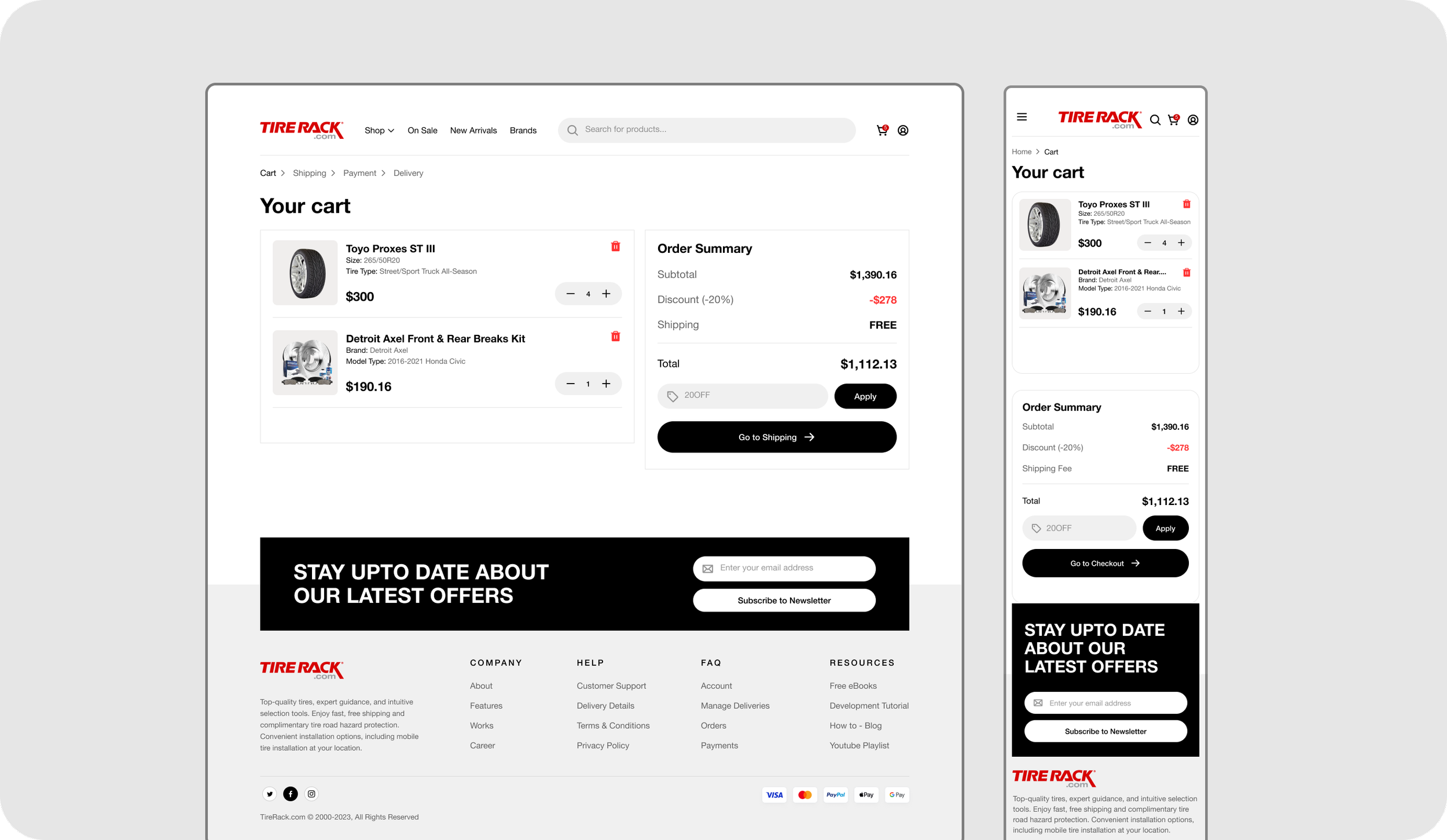
Smooth Checkout
Our simple, quick checkout process manages order review and payment in just a few efficient steps.
Research
Problem Statement
TireRack.com's current experience presents navigation and comparison challenges that create friction in the purchase journey, reducing user confidence and conversion rates. This redesign aims to streamline the path from search to purchase by simplifying interactions and providing clearer, more intuitive guidance for all users.
Research Goals for the Redesign
The research focused on identifying the key pain points and opportunities in the current user journey on TireRack.com. Through a heuristic evaluation and journey mapping, I assessed usability gaps, friction points, and moments of confusion. These methods helped surface actionable insights on navigation, product filtering, and decision-making support. The goal was to ground the redesign in evidence-based findings, ensuring every improvement directly addresses real customer needs.
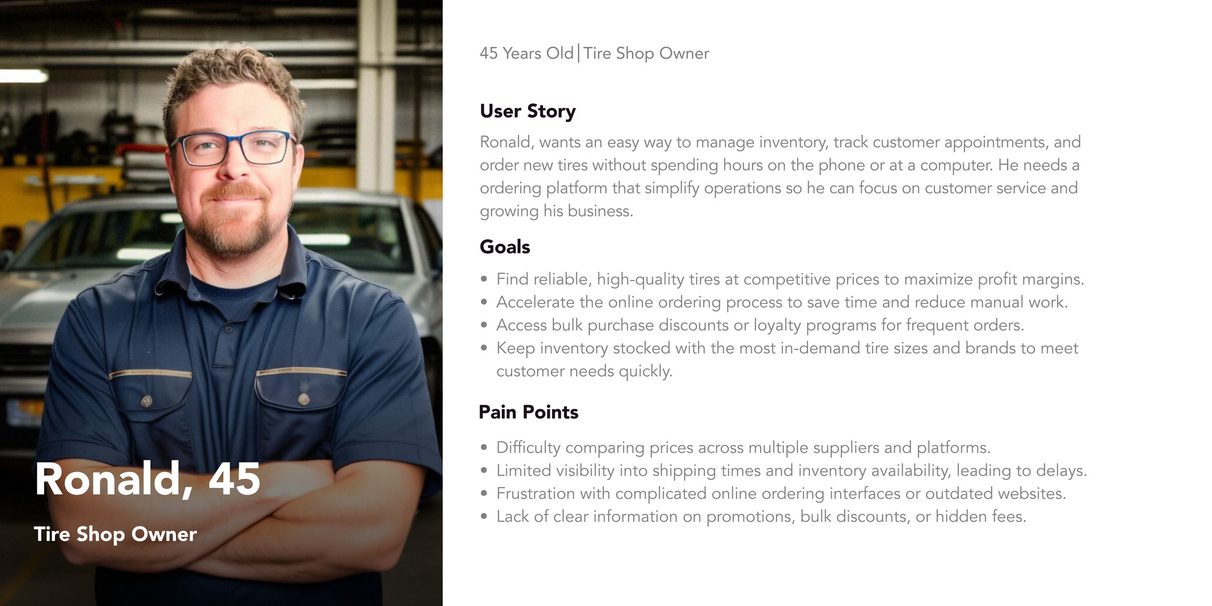
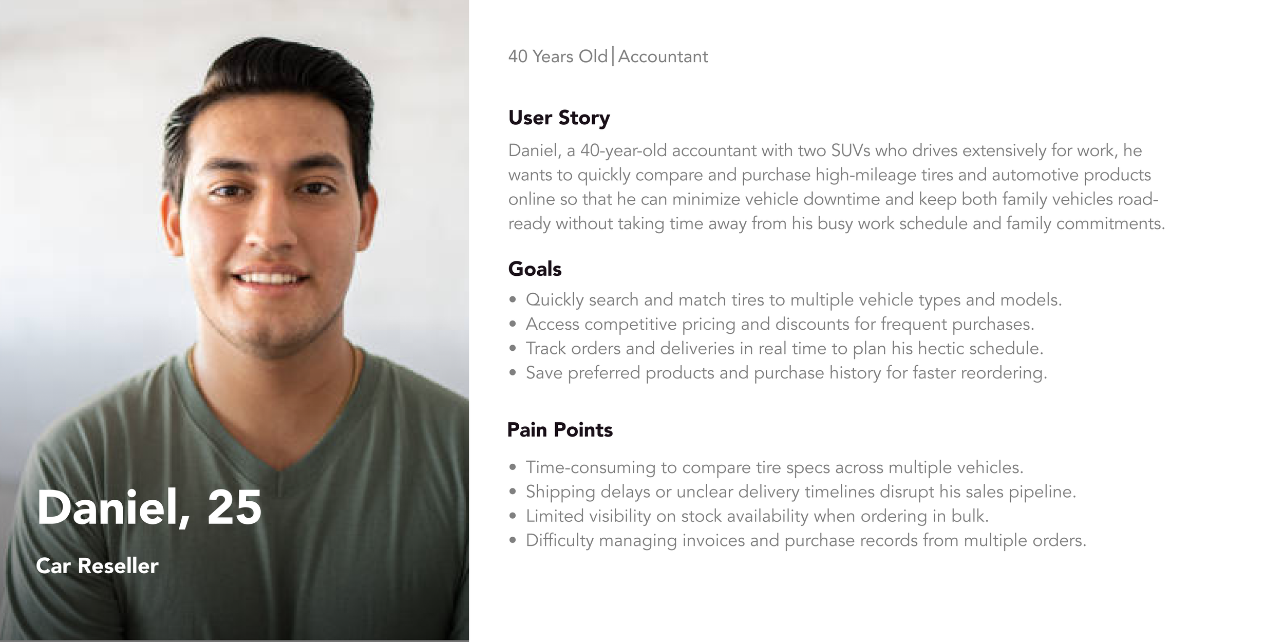
User Persona
I decided to create a user persona for Tire Rack to better understand and represent the needs, goals, and behaviors of its core customers. Tire Rack offers a wide variety of tires and automotive products online, but its customer base is diverse ranging from everyday drivers looking for convenience to tire shop businesses seeking to buy wholesale.
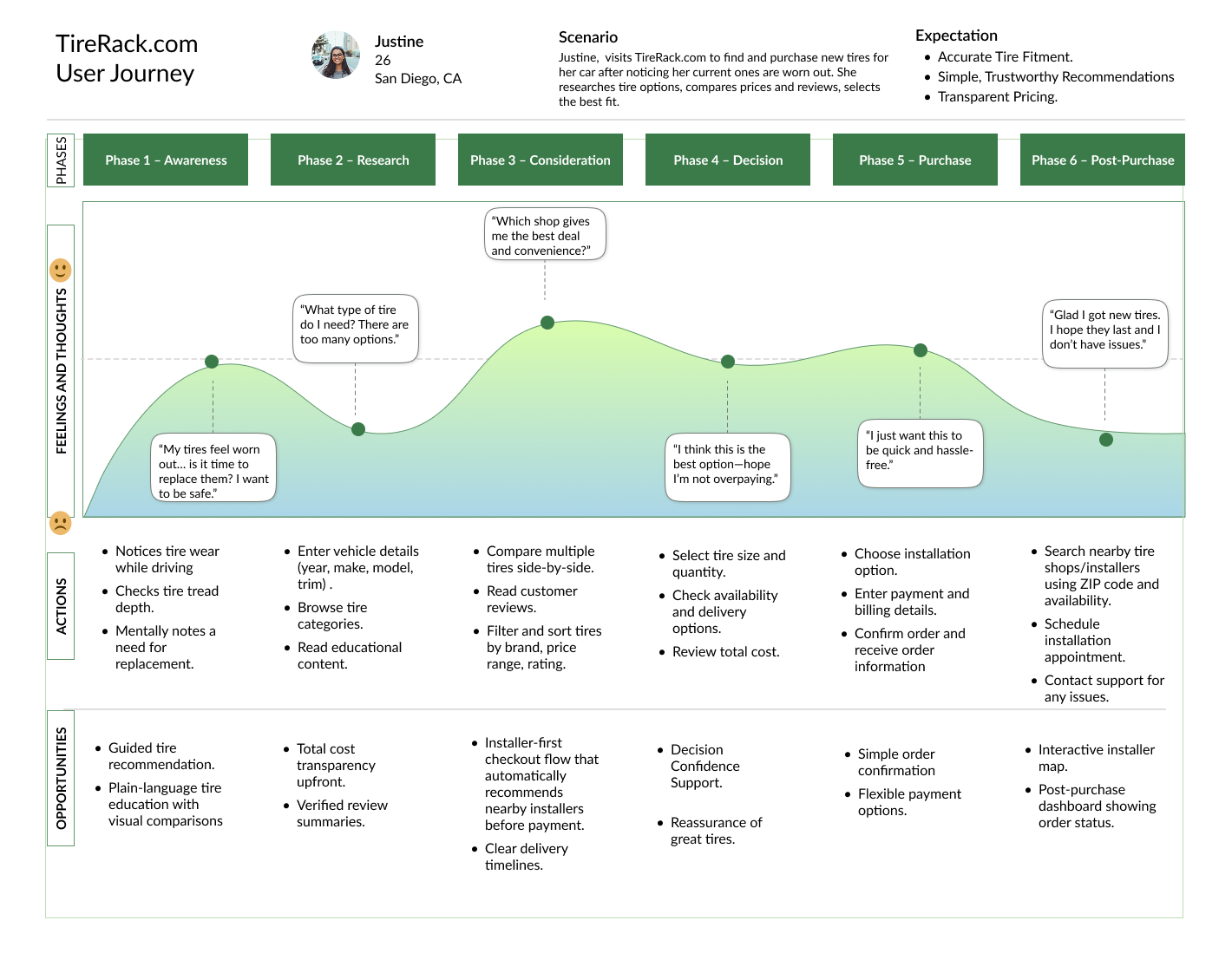
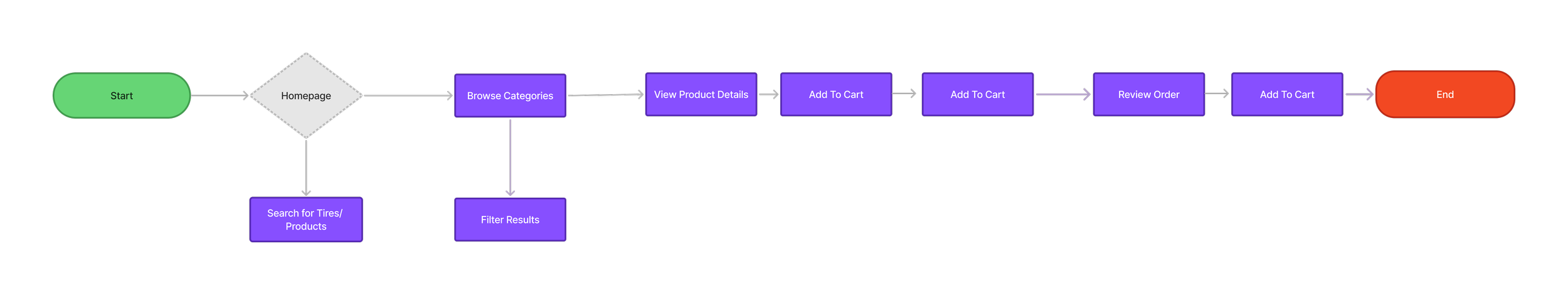
User Journey Map
For the next research phase, I decided to create a user journey map to clearly show how users experience the product from start to finish. This approach highlights pain points and opportunities, giving me actionable insights to drive smarter design decisions and deliver a better user experience.
Design
Goals for the redesign:
Cutting information overload and building an interface that feels clean and approachable.
Reworking the tire selection flow so the path to purchase actually makes sense.
Creating a visual hierarchy that makes comparing options feel easy, not like homework.
Placing CTAs in spots that feel natural, so users feel like they're making their own decisions rather than being pushed into one.
Design Decisions
TireRack's existing design, everything felt like it was fighting for your attention at once, there was no clear place for your eye to land. I decided to pull back on the visual noise and make sure the things users actually care about, like tire specs, pricing, and ratings, were the first things they saw. I studied competitors like Discount Tire and Simple Tire to understand what visual patterns users were already used to, and where Tire Rack had an opportunity to stand out.
Once the hierarchy made sense, scanning through options felt a lot less exhausting. At the end of the day, the less mental energy someone spends figuring out a page, the more likely they are to trust themselves and buy.
Mid-Fidelity Wireframe
I developed mid-fidelity wireframes for the home, product, and checkout screens to establish a clear content hierarchy and interaction flow. By using a grayscale design system, I intentionally removed visual distractions to focus on layout, spacing, and component placement. This foundational design work ensured key decisions were validated early and enabled a smooth, efficient transition into the final high-fidelity mockups.
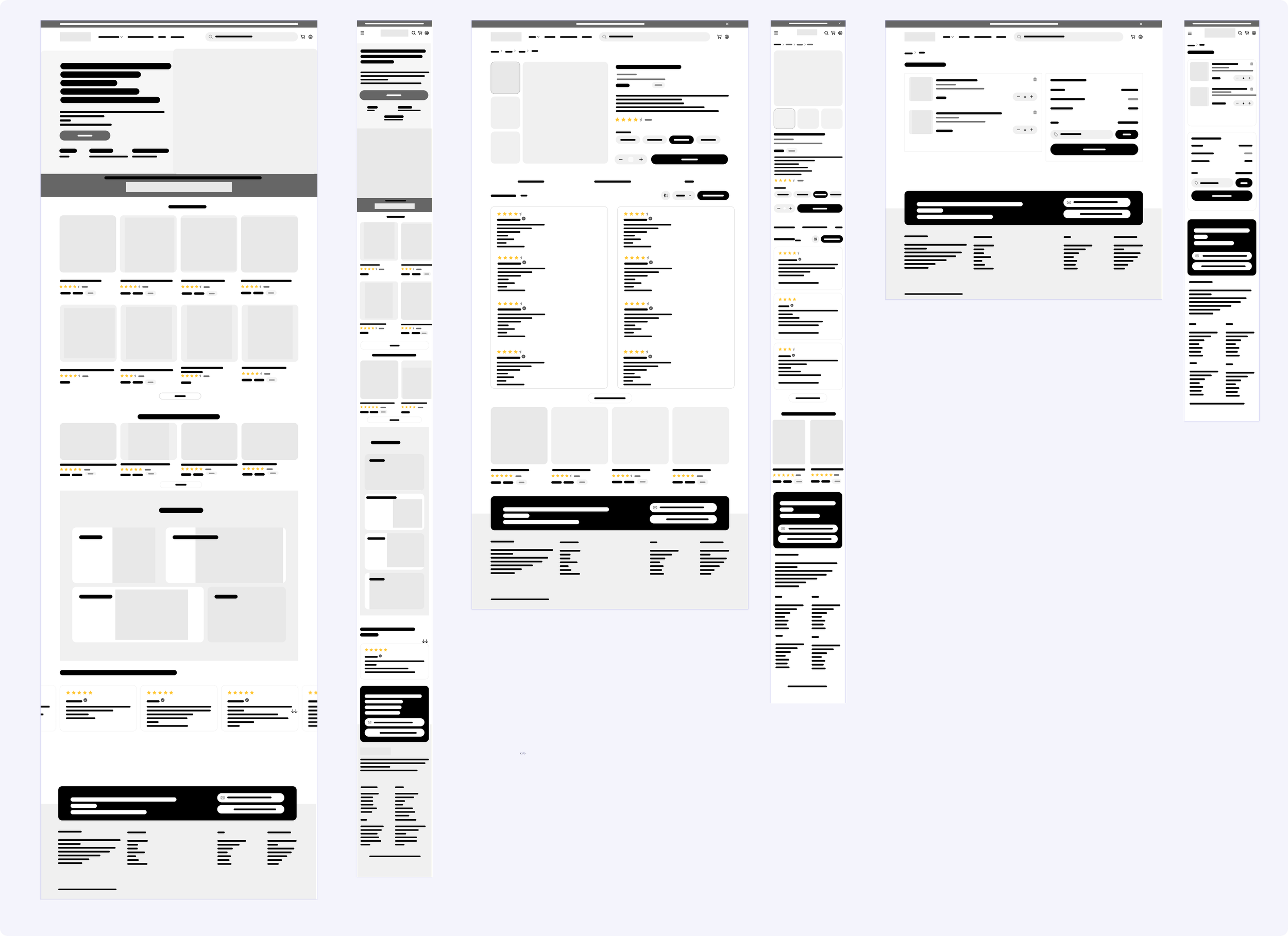
High-Fidelity Wireframe
I developed mid-fidelity wireframes for the home, product, and checkout screens to establish a clear content hierarchy and interaction flow. By using a grayscale design system, I intentionally removed visual distractions to focus on layout, spacing, and component placement. This foundational design work ensured key decisions were validated early and enabled a smooth, efficient transition into the final high-fidelity mockups.